Winner 2024 / Packaging / Beverage 
The tea has turned red
- PrizeWinner in Beverage / Packaging
- UniversityAnhui University of Arts
- LeadYan Wu
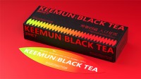
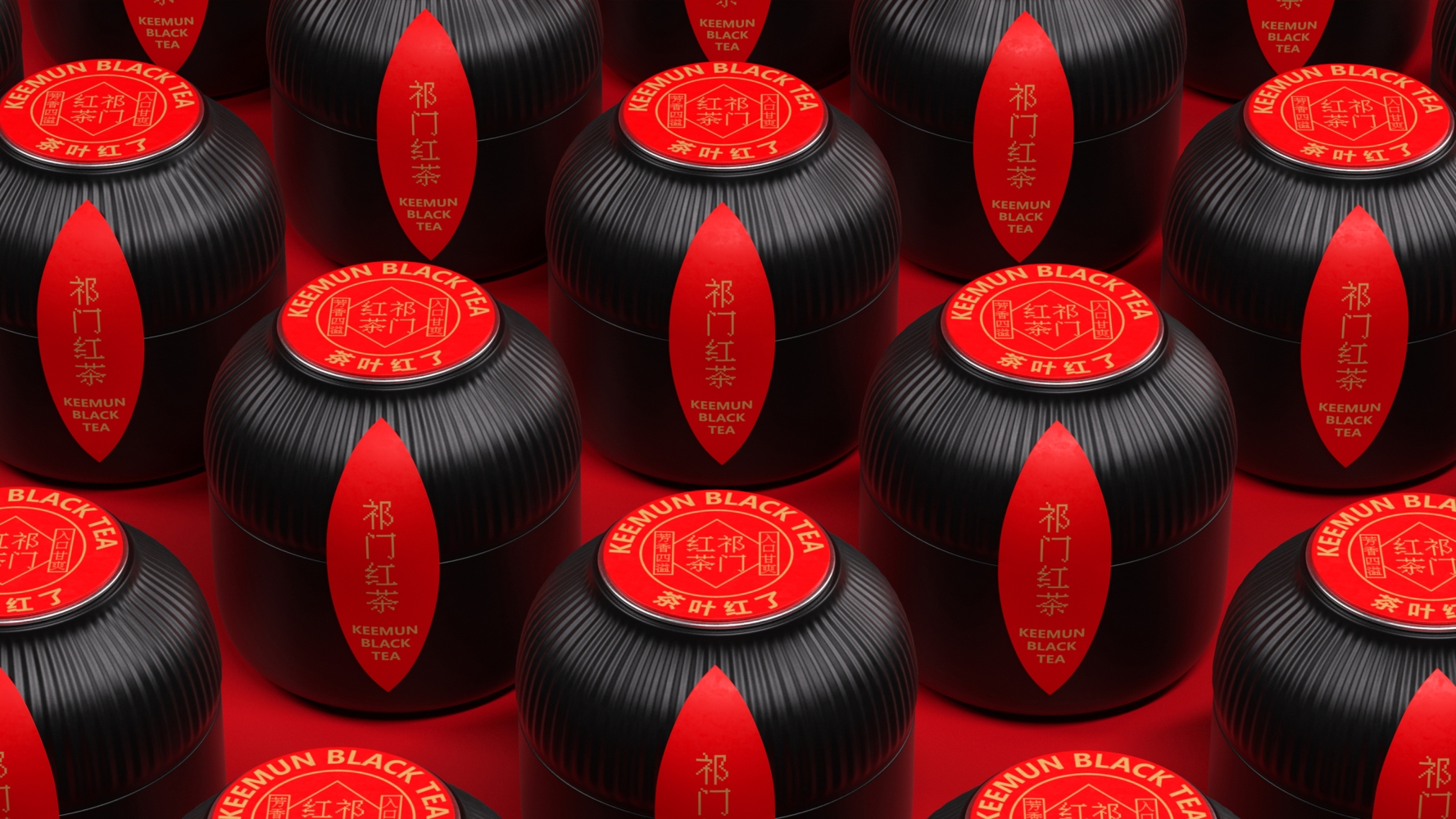
The graphic inspiration comes from the process of tea turning red, and consumers can clearly see the evolution of black tea, which effectively realizes the design theme of "tea turning red", and the visual communication effect is clear at a glance. The natural shape of the small cans inside the packaging resembles the "grain warehouse" in rural areas where grain is stored. The meaning here is "tea warehouse", which sounds the same as "tea collection". "Tea collection" is a private tea collection of tea lovers. This design implies that users will share their precious collection with their frien

