Winner 2024 / Packaging / Food 
Xun Mi Honey Packaging Design
- PrizeWinner in Food / Packaging
- CompanyRoking Art Design
- LeadQIN LUO
- ClientJI AN XUN BEE INDUSRY CO., LTD
- CreditsDesign Director: QIN LUO
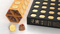
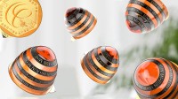
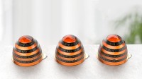
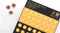
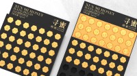
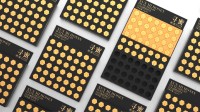
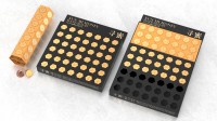
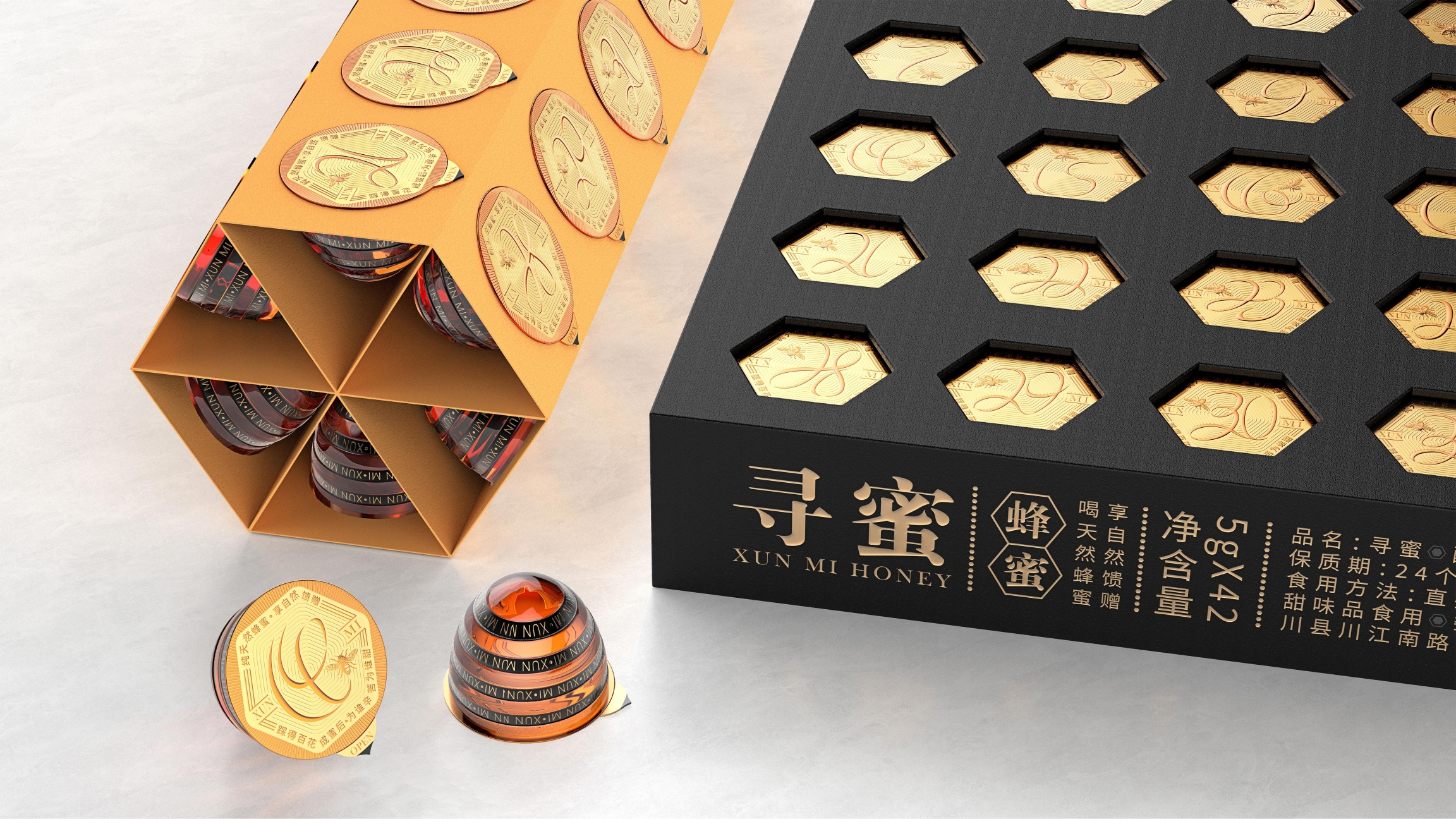
XUNMI Honey proposes the concept of a small jar of honey at a time, extracting the shape of the bee tail and the combination of yellow and black colors in the design. The packaging design of a small jar for one-time consumption is easy to carry. XUNMI is the meaning of looking for honey. The bee tail shape of the top lid suggests that consumers uncover and eat from this place; The design of the outer packaging adopts the form of calendar hollowed-out drawing. After opening, the whole row of small POTS of honey is folded into a hexagonal small calendar to urge people to stick to eating on time.

