Winner 2024 / Branding / Brand identity 
UpSpring Rebrand

- PrizeWinner in Brand identity / Branding
- CompanyUpSpring
- LeadAustin Berry, Design Director
- TeamSusan Fernandez, Austin Berry, Anneliese Grant, Carol Ehreth, Adam Stegall, Sadie Ostad, Ella Shackleford, Parker Benbow
- ClientUpSpring
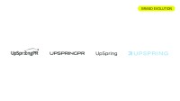
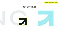
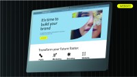
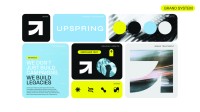
Developed by its in-house design team, UpSpring’s rebrand reflects its growth from a boutique agency into a fully integrated PR, marketing, and creative agency. The design process involved a thorough exploration of UpSpring’s evolving identity, services, and future. Centered around a refined but whimsical color palette of soft blue and black with pops of vibrant yellow, the final result is light, airy, and welcoming. A spirited “arrow” logo mark nods to UpSpring’s very first logo in 2009. The final branding package expertly balances professional strength and competence with an energetic charm.


