Berlin Tsushin Vol.001-050

- PrizeWinner in Other / Posters
- CompanyAizawa Office Inc.
- LeadYukihiko Aizawa
- TeamYukihiko Aizawa, China Nagata, Fumiko Inakuma, Atsuko Nishimura
- CreditsCooperation in transration: Shinya Watanabe
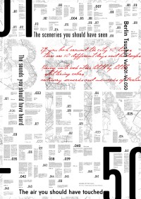
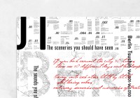
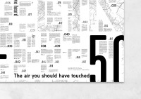
This poster was created to commemorate the 50th issue of “Berlin News” which reports on daily life in Berlin. A map of Berlin is arranged on the typography saying BERLIN, as if looking into the daily life of Berlin. In case of Berlin which was divided under occupation, the public fonts were established both in East Berlin and West Berlin. Based on the location of the article, Berlin East and Berlin West were used to arrange regional style. The city of “chaos” has been transformed into a city of “order and sensibility” in the present day and is visualized in the graphic design with uniformity.
For us, design is about sharing what brings us joy. Through the act of making that is design, such as graphic, editorial, signs, and corporate identity design, we had the opportunity to encounter amazing people as well as projects. Not a single one of them, however, could have been completed solely by us. Design takes shape through the collaboration and the words that are exchanged with many other people. We want to share in that joy too. This is what we believe design to be.


