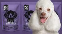
Pet Pet

- PrizeWinner in Pet products / Packaging
- CompanyA.S. Strategy Branding & Communication
- LeadAntonia Skaraki
- Project Link
- ClientPet Pet
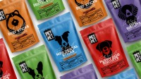
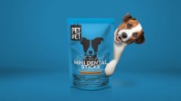
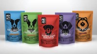
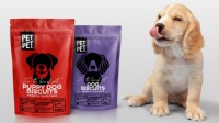
Pet Pet is inspired by the love for pets and incorporates vibrant, eye-catching colors. The packaging features simple graphics reminiscent of infographics, along with linear illustrations of dogs. Transparency is prioritized, with the nutrition facts table prominently displayed on the front. The logo, an illustration of a dog tag, symbolizes belonging and care. One unique detail is the paw symbol replacing the ™ symbol, signifying pet approval. The overall design creates a dynamic and postmodern brand that inspires positive emotions and a sense of freedom.
We’ve been around for 30 years. And turn younger by the day. We’re one solid team of 8 different characters. We believe creativity can change the world. We take our work seriously but not ourselves. Before we analyze a product, we sense its aura. Before we categorize it, we feel its power. We have the passion to make a difference and the knowledge to support it. We walk first then run. We don’t look troubled when troubleshooting. Every idea is a positioning on life. Every client is unique. We have a journey together. Let’s walk.

