Winner 2022 / Online Media / Websites 
Food Frontier Website Design & Development

- PrizeWinner in Websites / Online Media
- CompanyRock Agency
- LeadThy Ha
- TeamThy Ha (Designer); Tia (Design Oversight); Debendra Marahjan (Developer); Britta del Rio (Account Manager)
- ClientFood Frontier
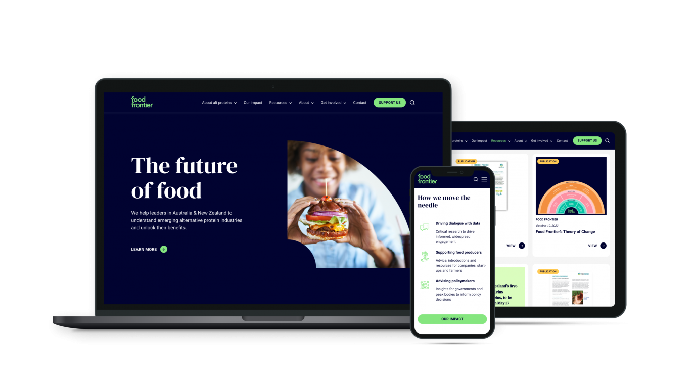
Food Frontier’s previous site was unruly and corporate – lots of information, difficult to sort and understand. Through user-first design, we reimagined the entire site from its foundation up. Not only is it now clean and visually compelling, but it’s 1000 percent more user-friendly. The homepage communicates the who, what and why succinctly; the integral Resources Library has been fully redesigned – we’ve added filtering, colour-coded categories, included a summary, and made the download process simpler. And, by integrating a donations page Food Frontier can now receive direct contributions.
A strategic digital agency helping ambitious brands thrive online.


