Tibet Shannan

- PrizeWinner in Logo design / Branding
- CompanyRiverliu Design
- LeadRiver Liu
- CreditsPhoto by Raimond Klavins / / Jeremy Bezanger Hire
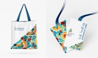
Shannan is the birthplace of Tibetan civilization. In Tibet, the visual design symbolizes the harmonious combination of heaven, earth, and man. The overall shape of the logo is inspired by the Himalayas and the Mani stone, while the colors that symbolize Shannan are derived from local attractions, culture, and colors. The logo incorporates a youthful and energizing visual aspect that contrasts with the brand’s deep cultural connotation, boosts the logo’s memorability, and represents a city that embraces all things.
On the journey of pursuing art, I have explored the aesthetics of design. Design is a challenging art. I innovate in rules and seek laws in innovation. I like things that are challenging, and I like communication and exploration. Therefore, I set the goal of becoming a designer. I studied visual design in China for 4 years, and then came to the United States for further study. In this country full of innovation and opportunities, I accumulated more systematic and commercial design thoughts. My life is closely related to art, which is also my lifelong pursuit.


