Winner 2022 / Branding / Brand identity 
Caleb & Brown

- PrizeWinner in Brand identity / Branding
- CompanyChello
- LeadNatalie Wong
- Project Link
- TeamCreative Director: Tristan Velasco, Strategy Director: David Coupland, Account Director: Drou Angelides, Senior Copywriter: Charlie Roberts, Designer: Rebecca Odey, Producer: Ceri Jones, Digital Designer: Louis Smith
- ClientCaleb & Brown
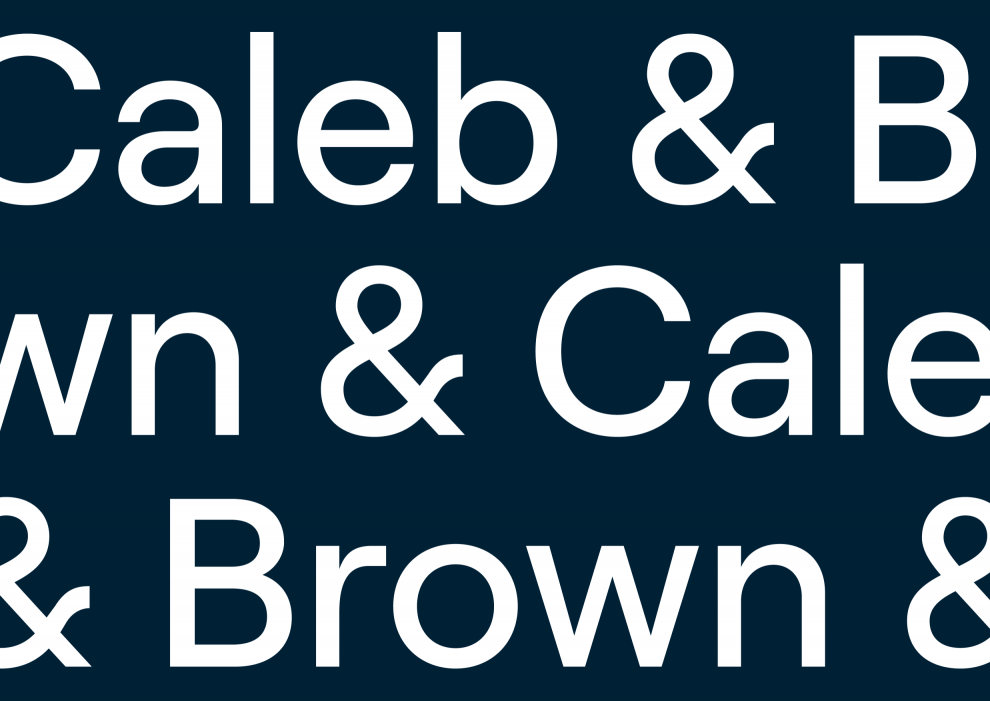
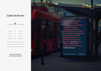
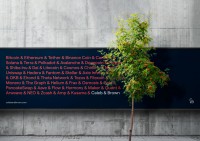
Caleb & Brown is the leading cryptocurrency brokerage in Australia. However the brand relied too much on a traditional aesthetic. We were briefed to define Caleb & Brown’s proposition and modernise the brand. Our strategy determined that Caleb & Brown was more than a broker, but a partner. This led the brand concept to start with people, but grew to accommodate the idea of endless possibilities. Inspired by their name, we used the ampersand to connect things. Replacing or combining ‘Caleb’ and ‘Brown’ with other words, to typographically express the idea of partnerships and possibilities.


