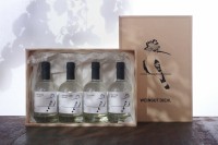
Diehl Winery | Brand Communication for Premium Destialltes
- PrizeWinner in Brand design / Branding
- CompanyBüro Sabine Mescher
- LeadSabine Mescher
- ClientWeingut Diehl, Stuttgart, Geramny
- CreditsPhoto by Uli Maier fotodesign Stuttgart / Germany
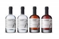
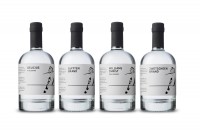
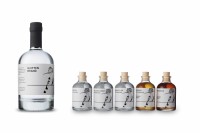
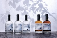
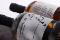
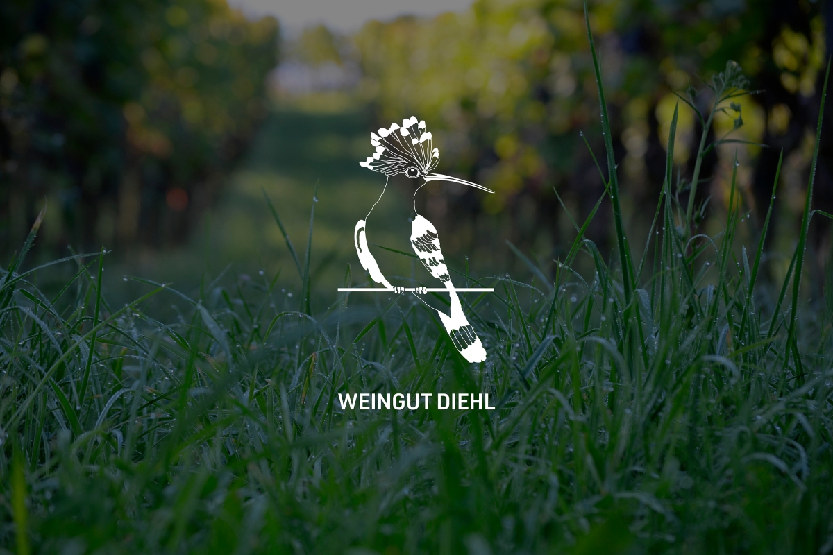
Since 2019 the Diehl Winery is run in the 3rd generation with a new branding. The hoopoe, a migratory bird, helper in the vineyard, become the signet and key visual of the family winery. It is a symbol of global connection and regional rooting. Starting 2020 the distillates, which are distilled on the estate, were dedicated to the hoopoe. The philosophy: quality instead of quantity, products produced with love and naturally down to the last detail, authentic and local. This is also shown by the black and white label with its clear communication, explanatory texts and lovingly illustrations.
I am a visual communication designer. I am a lover of typography, my designs are reduced rather than decorative. My main focus is corporate design and corporate identity projects with a strong focus on the overall concept, because I am convinced that we can only make good design if we think about the task until the end. My experience: Careful logo and signet development, corporate design that fits the company. Brand design and naming, with the target group in focus. Brand and target group oriented print media, such as image brochures, User-friendly website conception and design.


