Winner 2021 / UI & UX Design / User Interface design 
RIT course management website redesign

- PrizeWinner in User Interface design / UI & UX Design
- UniversityRochester Institute of Technology
- Leadjiaqi liu
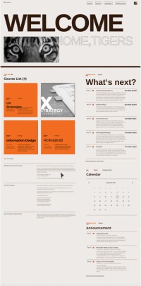
The project is about a redesign of the RIT ‘My Course’ page. The current site is not well organized, not stylish, and has limited features. First, the project involves a visual redesign of the website with the inspiration of Swiss Design style. While keeping the original RIT orange color and tiger element, the website was rebranded with a new color theme, a new layout grid, refreshed typography, and updated interface styles. The new visual will show a better information hierarchy and provide a smooth and pleasing reading experience.


