Honorable Mention 2022 / UI & UX Design / User Interface design 
Rochester Travel App Design
- PrizeHonorable Mention in User Interface design / UI & UX Design
- UniversityRochester Institute of Technology
- LeadIsabelle Qiu
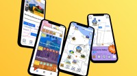
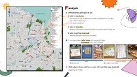
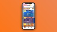
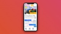
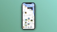
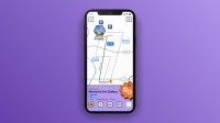
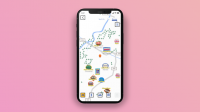
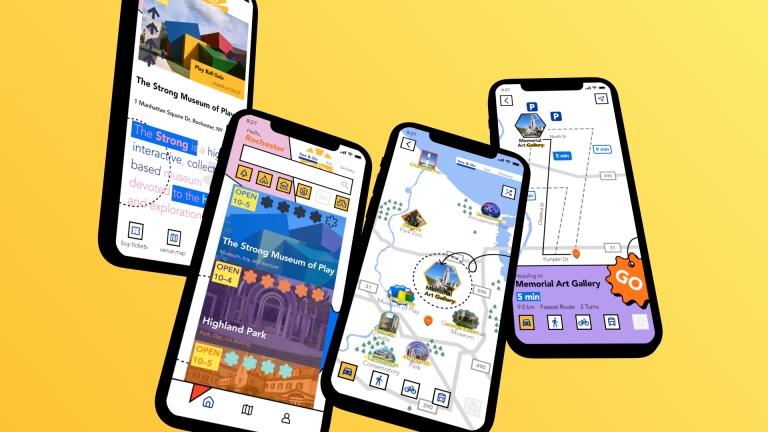
This project aims to choose an existing map in the greater Rochester area and redesign it. I picked a sightseeing map of Rochester as the starting point since I am interested in traveling. After conducting field trips to local tourist attractions, restaurants, and grocery stores, I extracted some visual elements as the primary aesthetic style to make the user interface impressive and vivid. Moreover, information architecture is also reorganized to create a more effective user experience.

