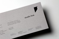
Logodesign for Studio Fink
- PrizeHonorable Mention in Logo design / Branding
- CompanyJaeger & Jaeger
- LeadOlaf Jäger
- TeamRegina Jäger, Key Account, Carina Kolb, Design
- ClientStudio Fink GmbH
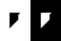
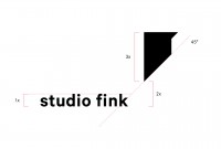
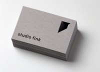
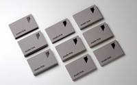
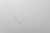
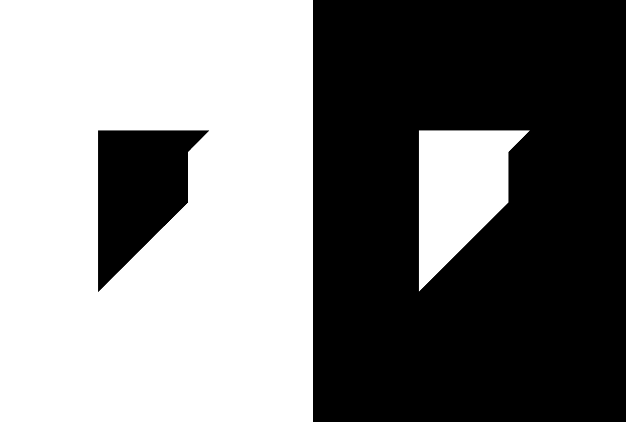
Form follows Fink. Obvious and yet completely different. A reduced formal language that visualises the name on the one hand and conveys architectural principles on the other. Straightforward, clear and reduced - the shape of the logo thus supports on the one hand the claim to the genre of architecture in general and in particular the individual style of the young office in Ulm, which is positioning itself anew on the market with this appearance. Finishes such as embossing and glossy varnish give the logo additional haptics and depth.
jäger&jäger is an owner-run agency for Brand Identity and Branded Content. We love to inspire people … Our customers, through personal, close and agile collaboration … Your customers, through an exceptional brand experience.The best is yet to come.

