Honorable Mention 2023 / UI & UX Design / User Experience Design 
Building a Brand for Ashland University
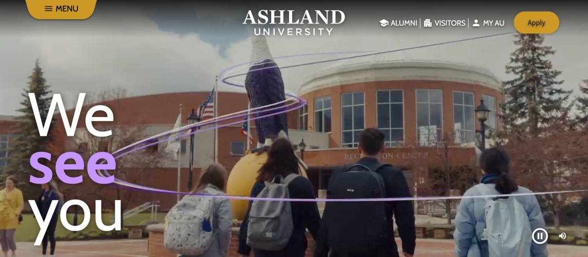
- PrizeHonorable Mention in User Experience Design / UI & UX Design
- CompanyImageX
- LeadMahya Golabi
- TeamMatt Pettifer, Christine Elmarji, Dmitry Buzinov, Marta Beynon
- ClientAshland University
- Video
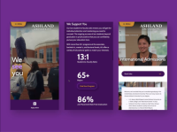
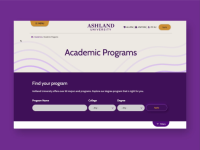
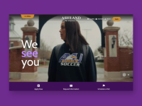
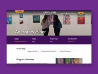
Ashland University needed a website that reflected the student experience. HigherEd sites are typically verbose and text-heavy. The approach was to do things differently and design for the senses with a modern and conversion-orient user experience. The final strategic concept was designed to align the goals of the site with the larger vision of the university and its motto “Accent on the Individual”. The solution our team designed and built leaned fully into this theme, ensuring clarity of message and helping the end users to truly see themselves living, and thriving, at the institution.


