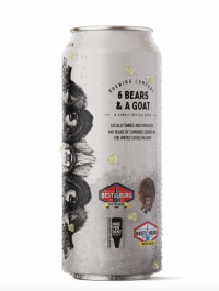
Honorable Mention 2021 / Packaging / Beverage 
6 Bears and a Goat Brewing

- PrizeHonorable Mention in Beverage / Packaging
- UniversityVirginia Tech
- LeadAmber Breeden
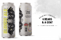
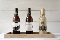
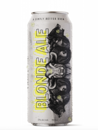
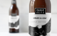
While paying respects to the owners’ service utilizing the imagery of the bear and goat in the labels/branding, this logo also pulls from the company's concept of a “simply better brew,” by using a simple word mark & design.The goal was to elevate this brand and make it stand out from other local breweries. To do this, the main color scheme was black and white with added spots of color to differentiate between brews and add some visual interest. Illustrations are used throughout the branding. Premier beer is packaged in bottles and the color palette is kept simple to show elegance.

