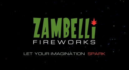
Honorable Mention 2021 / Branding / Logo design 
Zambelli Fireworks - Logo design and Motion Graphics

- PrizeHonorable Mention in Logo design / Branding, Animations / TV / Film / Animation
- UniversityTexas A&M University - Commerce
- LeadHunter Paulsen
- Video
Logo design was a re- branding of a usual fireworks retail company intended to provide modern, clean feel rather then the very complex, busy existing logo. The Dragon is intended to provide a fantasy element, adding to the ideas of imagination, excitement and sense of grandeur that a well crafted fireworks display creates. The dragon image serves as the face of Zambelli that also contains small details for firework visuals. Simple in design, the two- color palette, one stroke illustration, is intended to be an instantly recognizable image for the brand.
Visual Communication Art Student


